 abc
abc
Level I STEP 2
Simple, two-variable regressionA note on testing the significance of a regression line |
Regression analysis might be more readily called 'preliminary prediction analysis'.
We have already noted that there are two useful ways to analyse a relationship; one is Correlation and the other is Regression. Correlation sets out to determine if there is a relationship between two variables and also measures the strength of any relationship but regression goes one step further. Regression is used to find a model (a formula for the line) for that relationship so that new values of one variable might be predicted given a value for the other. We will endeavour to place a 'line of best fit' through the plotted pairs of variables. This line will have a number of interesting properties....it is always straight and the steepness of the slope (a measure of the way that one variable changes as the other changes) may suggest that the relationship is proportionally balanced or very disproportionately balanced.
Both techniques require a scattergraph as their starting point. As with correlation (remember: no line is drawn though), the direction of the slope will indicate whether the relationship is positive (proportional) i.e. as one variable increases, so does the other or negative ( inversely proportional) i.e. as one variable increases, the other decreases. We are now looking at the dependence of one variable upon the other and this in turn may indicate if a 'cause and effect' relationship exists. We must be very cautious though about saying that "one change has caused the other", causation is very hard to prove, especially in the field of environmental studies.
So whereas correlation looks for an association, regression goes further and utilises that association in order to make predictions of one value given the other. The predictor (what has been measured) is always placed upon the x axis and the variable upon which we wish to make value predictions is always placed upon the y axis. Put another way; the independent variable (the error free variable) should be plotted on the 'x' axis and the dependent variable on the 'y' axis. Remember also that we are always using paired data.
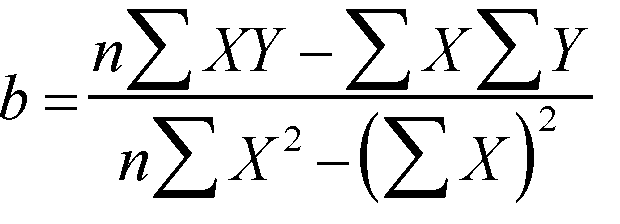
The issue now is how to create this 'line of best fit'...it is not simply a 'by eye' exercise but has to be done mathematically. One way is simply to draw a line that passes through the mean value of X and the mean value of Y but there is a more accurate way. We need an equation for the line that takes into account the location of all the intersecting points on the scattergraph....
Y = a + bX
where a is the interception point on the 'y' axis (the regression constant) and b is the regression coefficient (usually termed 'r') and is a measure of the steepness of the slope. If the line cuts the y axis at a value for x that is less than zero, then 'a' becomes negative. Furthermore, 'b' can be either positive or negative depending upon which direction the slope of the line takes.
If the scattergraph appears to suggest a curved relationship, the data could be transformed first. Transforming the data (for example, by taking the log of the values of one or both variables) can produce a straight line from a curved one.
Note also that it is possible to produce two regression lines depending upon whether the X-residuals are minimised or the Y-residuals (see note on residuals further down this page). Naturally both lines will pass through the mean value point of X and the mean value point of Y. In practice, we do not use the corollary:
bX = Y - a
One special case should be mentioned and that is where the regression point passes through the origin i.e. both X and Y = zero at this point. Special formulae exist in these cases and the procedures outlined here do not apply.
Before dealing with the mathematics let us consider the following situation.
 A
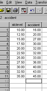
survey carried out by the AA suggests a relationship between blood alcohol
levels and the number of road accidents. The data they collected did not include
readings below 10mg /100ml of blood or above 35mg / 100ml. They want to try
to predict the number of accidents recorded in one year (shown below: x 000)
that are likely to occur with just 5mg / 100ml
and at 40mg / 100ml.
A
survey carried out by the AA suggests a relationship between blood alcohol
levels and the number of road accidents. The data they collected did not include
readings below 10mg /100ml of blood or above 35mg / 100ml. They want to try
to predict the number of accidents recorded in one year (shown below: x 000)
that are likely to occur with just 5mg / 100ml
and at 40mg / 100ml.
The data set below has been created in SPSS. [SPIEX 08]
The dataset can be quickly displayed as a scattergraph...
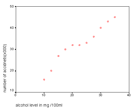
It should be quite apparent that a relationship does exist between these two variables. We can calculate a mean value for 'x' and a mean value for 'y'. Any line of best fit is going to have to pass through the point where those two values intersect.
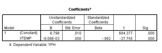
When using SPSS (explained later) a very large and comprehensive output is generated. The main points of interest at this stage however, are illustrated below.
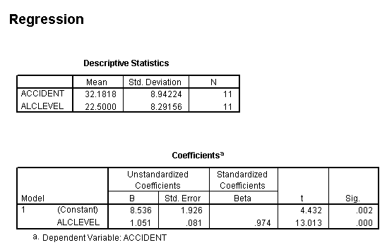
So our regression constant ('a') is shown as 8.536 and our regression coefficient (r) is shown as 1.051(i.e. 'b' in our basic equation). We can now insert all this information into our equation to crosscheck the math's. Using the known mean value for 'X' (22.5) we should be able to derive the mean value for 'Y'. We actually already know this figure from 'sigma accident divided by 11' but now we will use the 'straight line formula' route...
Y = a + bX
Y = 8.536 + 1.051 x 22.500
Y = 8.536 + 23.648
Y = 32.184
Interpolation and Extrapolation
Now that we have proved the formula is correct, we can insert any value for 'X' or 'Y' and calculate the other.
In essence the AA want to know the value of 'Y' when 'X' =5 and when 'X' = 25
Y = 8.536 + 1.051 x 5 = 13.791, that is 13791 accidents
and
Y = 8.536 + 1.051 x 25 = 34.810, that is 34810 accidents
As a simple check, go back to the graph and see if these results make sense to you.
There is a problem where we try to determine a figure outside of the range of collected values. Such a procedure is called 'extrapolation' and is not to be recommended. Simply because we have established a straight-line relationship between two variables over a certain range does not mean that this relationship continues above or below that tested range. The denaturing of proteins with heat is a good example where changes occur in a stepwise fashion.
We cannot say therefore that at 40 mg of alcohol that the number of accidents will be 50576 because we just do not have the evidence.
Although the manual method of calculating regression lines is somewhat lengthy, it is important to understand how the line has been derived. It is a line which represents the "least square differences of all points along that line".
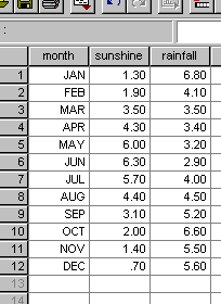
 The tourism department of 'Blisstown-on-sea' want to highlight their sunshine
record and want to be able to give some comforting predictions to prospective
visitors about how little rainfall they get, particularly in the summer!!
For a full year they monitor the daily figures and then work out the monthly
mean values. [SPIEX09]
The tourism department of 'Blisstown-on-sea' want to highlight their sunshine
record and want to be able to give some comforting predictions to prospective
visitors about how little rainfall they get, particularly in the summer!!
For a full year they monitor the daily figures and then work out the monthly
mean values. [SPIEX09]
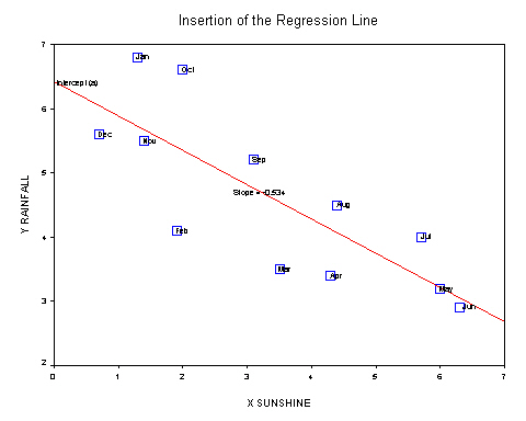
Here are the results (sunshine: mean hrs/day, rainfall: mean mm/day) and the scattergraph....
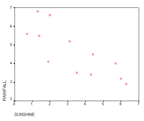
Most people would assume that there is quite a close relationship between hours of sunshine and levels of rainfall but the scattergraph seems to show some wide variation. However we can see a pattern and the slope would appear to be a negative one. Is it possible to predict the amount of rainfall given the sunshine levels? For all regression charts, we start from a known value on the x axis, move upwards and then read across for the predicted value on y. Do not be tempted to interpolate in the opposite direction!!
Q. How would you interpret this pattern?
Q. What is the main weakness in using this data when trying to make predictions?
The manual calculation of the 'line of best fit'...
Firstly we need to calculate 'b', the slope ( regression coefficient). The formula is not as frightening as it looks! However, we do need to sum each column and to square each individual 'X' value.
In the earlier case 'sunshine' is on the 'X' axis and 'rainfall' is on the 'Y' axis.
Remember that we have to calculate 'b' first.....
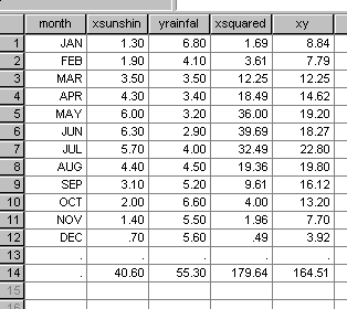
Now Sigma X = 40.6 and Sigma (all the) X squared = 179.64 and (Sigma X) squared = 1648.36
and Sigma Y = 55.3
So Sigma XY = 164.51
n = 12
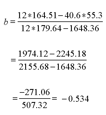
So b = - 0.534.
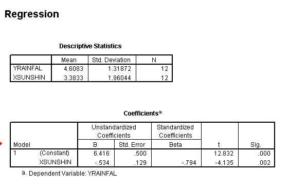
The mean of x will be 40.6 / 12 = 3.383 and the mean of y will be 55.3 / 12 = 4.608 and we can now begin to rearrange the basic straight line formula to calculate 'a'.
a = mean of 'y' - b*mean of 'x'
So a = 4.608 - b*3.383
a = 6.416
So now we have the full and final equation for the line of best fit for this particular set of data...
Y = a + bX
Y = 6.416 - 0.534X
Checking in SPSS>>>>
Let us go back to the original data and check out July where the sunshine was 5.7 hours; what would be the predicted rainfall?...
Y = 6.416 - 0.534*5.7 = 3.371
Q. But Y from the data had a real value of 4.00, why the difference? (clue: read the note below about 'residuals')
Now that we have the equation for the line we can solve questions such as "If we have 2.65 hours of sunshine, what is the the level of rainfall that we are likely to get....
Y = 6.416 - 0.534*2.65 = 5.00.
Check against the graph....correct!!
Do not be tempted to interpolate in the other direction, i.e. given the amount of rain...can we estimate the amount of sunshine. If you wished to do this it would be necessary to reverse the x & y variables.
Q. Would we be justified in making any statement about 'cause and effect' such as "high rainfall causes the sunshine figure to be low" or "high sunshine figures causes the rain to go away".
Q. As the chief tourism officer for Blisstown-on-sea write a paragraph for the local guide book utilising the findings detailed above.
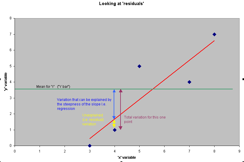
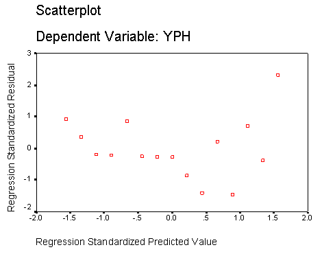
An important note about 'residuals'
You will have noted that some months give a result that is much closer to the regression line than others. Compare January with November for instance. These 'distances from the fitted line' are referred to as the 'residuals'. It is possible to work out both the 'x' and 'y' residuals for any point on the scattergraph but in practice (and for significance testing) we look only at the variation in 'Y'.
Let us look at November when the sunshine figure (X) was 1.4 hours and the rainfall (Y) was 5.5mm.
We simply insert into the line formula one of these values to produce a value for the other that will sit on the line....
So when X = 1.4 what should the value of Y be?
Y = 6.415 -0.534*1.4 = 5.667 and so the residual (on Y) is ,in this case quite small [5.5 - 5.667 = -0.167] and you will see that the November point is very close to the line. However let us now carry out the same calculation for October where the value for X was 2.0...
Y = 6.415 -0.534* 2.0 = 5.347 and here the original value for Y was 6.6mm and so the residual (on Y) is...
6.6 - 5.347 = +1.253
Note that values below the line are negative and those above are positive.
In theory, the residuals on X can be found in just the same way simply by taking a known value of Y and substituting in the equation: bX = Y - a but there is little point in doing this.
There is another useful output that SPSS can yield which looks at the values of all the Y residuals) and compares them with the values derived from the line of best fit. If these two sets are plotted against each other we should see a wide scatter of points with no obvious patterning. This confirms the linearity of our plot because the values above and below the line have 'balanced each other out'. If patterning is apparent then the dataset needs to be reexamined because the assumption of linearity would now be suspect....
Q. Compare the residuals on (X) for April and August. Which side of the line is positive and which is negative?
Q. What will be the situation with regards to the residuals for January and October?
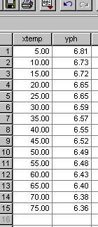
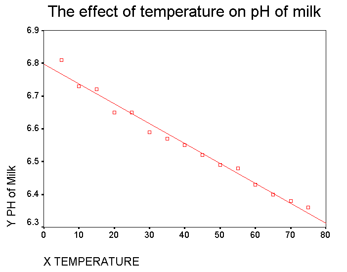
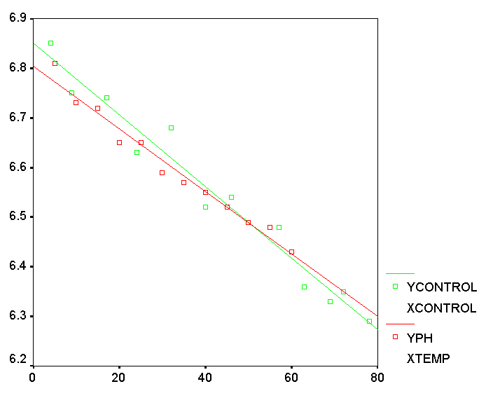
 There
has been a milk safety scare that has been traced back to a local dairy. As
part of the routine checks a sample is taken back to the laboratory for analysis.
The pH of 15 sub-samples is measured at different temperatures from 5°C
up to 75°C. We are interested to know if it is possible to predict the
pH of milk simply by measuring the temperature. Note also that we are not
trying to calculate the temperature by measuring the pH !!
There
has been a milk safety scare that has been traced back to a local dairy. As
part of the routine checks a sample is taken back to the laboratory for analysis.
The pH of 15 sub-samples is measured at different temperatures from 5°C
up to 75°C. We are interested to know if it is possible to predict the
pH of milk simply by measuring the temperature. Note also that we are not
trying to calculate the temperature by measuring the pH !! 
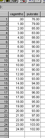
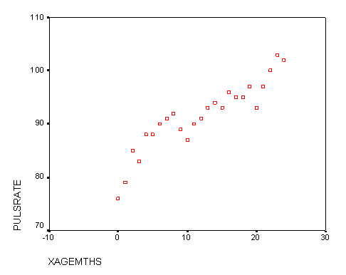
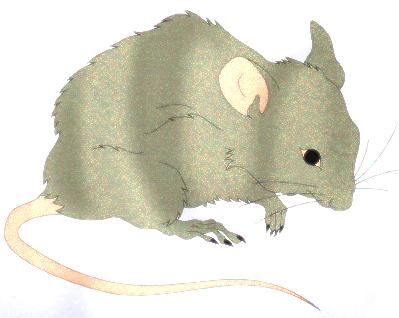 All mammals show a change in pulse rate as they get older. Given the mouse
age, can we predict the likely pulse rate? A set of 50 laboratory mice were
examined at monthly intervals for 2 years from birth. The pulse rates (beats
/ minute) were all measured each month and a mean value was calculated. Here
are the results and the basic scattergraph...
All mammals show a change in pulse rate as they get older. Given the mouse
age, can we predict the likely pulse rate? A set of 50 laboratory mice were
examined at monthly intervals for 2 years from birth. The pulse rates (beats
/ minute) were all measured each month and a mean value was calculated. Here
are the results and the basic scattergraph...