 abc
abc
abc
Summary of contentsTesting for Association The concept of Correlation Spearman's Rank Correlation Coefficient test (SRCC) Pearson's Product Moment Correlation Coefficient (PPMCC)
|
We have noted on a number of occasions that our brains are conditioned to absorb graphical images / patterns much more readily than pages of tabular data. We can utilise this attribute to compare two variables and to see quickly how they relate to each other and to see what happens to one value if we alter another...
(do not concern yourself with what the variables or values actually are...just concentrate on the patterns).
 |
 |
 |
 |
It should be very apparent that the relationship between the x variable and the y variable is quite different in all four cases. We could start by trying to define the relationship just by using words...
|
Apparent relationship |
|
|
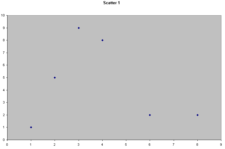
Scatter 1 |
There seems to be little or no relationship here. x and y seem to vary independently of each other |
|
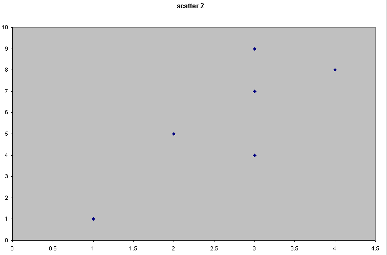
Scatter 2 |
There seems to be a relationship because as x increases, so does the value of y. Call this a weak but positive correlation |
|
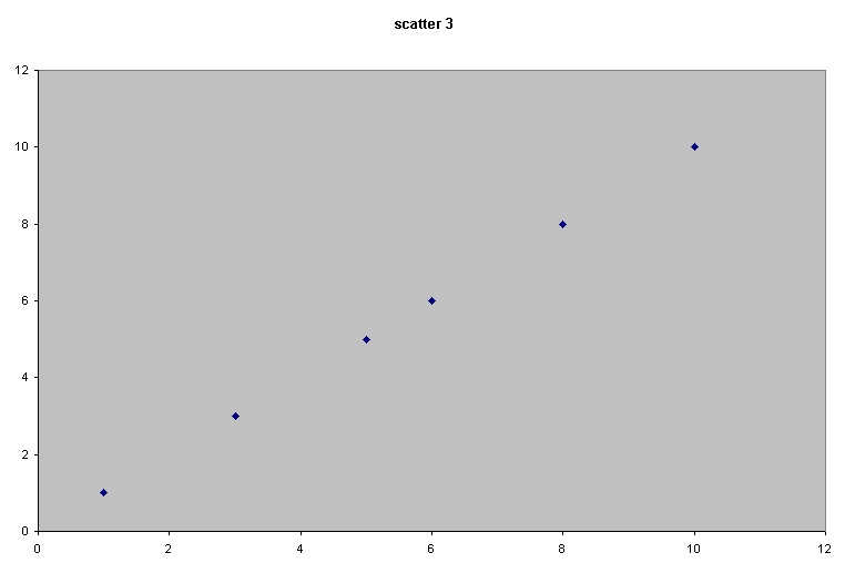
Scatter 3 |
This suggests a very strong relationship because as x changes, y changes by an exactly equal degree. We call this a perfect and positive correlation. |
|
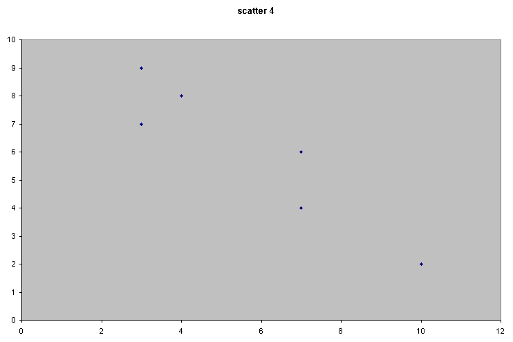
Scatter 4 |
Here there appears to be a relationship similar to scatter 2 but now as x increases; y decreases. Call this a medium and a negative correlation. |
It would be very useful to be able to place some numerical value to these 'degrees of association' that we have noted and to define the direction of the relationship. We had already learnt from using Chi-square and the K-S tests that we can determine if a relationship exists but unfortunately they do not tell much about the strength or direction of that relationship. Correlation begins to do this.
Q. Which axis should be used for the Independent Variable and which should be used for the Dependent Variable?
Now look at scatter 2 and 3 and imagine that we superimposed a 'line of best fit' onto both. It might be that the line would be the same in both cases but clearly the data sets are different. We must now create a coefficient (r) which will give us a comparative measure of how close our values are to an imaginary line of best fit.
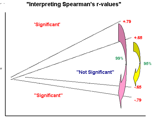
The 'correlation coefficient' is really a sliding scale (index) that runs from -1 through zero to +1...
|
r = +1 |
100% positive correlation |
|
r = 0 |
totally random spread, no association at all |
|
r =-1 |
100% negative correlation |
Points to consider:
1) In the tests that follow we will be calculating r and r squared as our test statistics.
2) We will still need to devise a Null hypothesis and we will also be testing for significance.
3) The exact choice of test will be decided by the particular scale of measurement that our test data is on...
|
VARIABLES: X AND Y |
TEST to use: |
|
one or both are on the Ordinal scale |
Spearmans Rank Correlation Coefficient (SRCC) |
|
both are measured on the Interval or Ratio scales and are normally distributed |
Pearsons Product-Moment Correlation Coefficient (PPMCC) |
As the name suggests, we will be ranking each variable separately and then comparing the ranking positions of each value within each pair.
E.g..
| Variable A (rank position) | Variable B (rank position) | difference (d) | |
|
Case 1 |
5 |
4 |
+1
|
|
Case 2 |
2 |
4 |
-2
|
|
Case 3 |
3 |
2 |
+1
|
Consider the following case:
 We have examined the issue of beach cleanliness on earlier occasions. There
are two national schemes in operation, the 'Blue Flag scheme' and the 'Seaside
awards' It would be helpful to know if these two schemes are comparable. Do
they draw similar conclusions? Are they complimentary or does the duality of
beach inspections simply confuse the public because the benchmarks and priorities
are different?
We have examined the issue of beach cleanliness on earlier occasions. There
are two national schemes in operation, the 'Blue Flag scheme' and the 'Seaside
awards' It would be helpful to know if these two schemes are comparable. Do
they draw similar conclusions? Are they complimentary or does the duality of
beach inspections simply confuse the public because the benchmarks and priorities
are different?
We can start by doing a simple Spearman's test. We will look at the results from 10 beaches (A - J) that were judged by both groups. All 10 beaches were placed in a rank order from best to worst (i.e. Ordinal data).
Once again we must remember to start with a Null hypothesis:
Ho "There is no correlation between the rankings given by the Blue Flag scheme and those issued under the Seaside awards scheme"
Q. Write down a suitable alternative (H1) hypothesis.
It is important to remember that these are ranks and not actual values, it is quite possible that each final rank was arrived at by totaling up scores from many other parameters such as litter levels, safety features, noise, access, car parking etc. etc. Remember also that this is paired data and must not be split (we are not trying to compare the Blue Flag score for beach A with the Seaside score for beach B for example).
Any condensing or summarising of raw data must be undertaken before the final rankings are used (see cautionary note below).
We will be calculating the difference between the rank values for each pair and also squaring that difference to remove negative values. Here are the ranked results...
|
INSPECTED
BEACH (n =10)
|
Rank awarded [Blue Flag scheme] | Rank awarded [Seaside awards] | difference | difference squared |
|
A |
1 |
3 |
-2 |
4 |
|
B |
2 |
4 |
-2 |
4 |
|
C |
3 |
1 |
2 |
4 |
|
D |
4 |
2 |
2 |
4 |
|
E |
5 |
6 |
-1 |
1 |
|
F |
6 |
5 |
1 |
1 |
|
G |
7 |
7 |
0 |
0 |
|
H |
8 |
10 |
-2 |
4 |
|
I |
9 |
8 |
1 |
1 |
|
J |
10 |
9 |
1 |
1 |
|
Sum of: d squared = |
24 |
Remember to construct a Null and Alternative hypothesis here.
We now have to use the Spearman's formula to calculate our test statistic (rs)
 |
So: rs = 1 - (6 x 24) / 10(99)
= 1 - 144 / 990
= 1 - 0.145
= 0.855 (note that the figure is positive)
This means that we have found a positive correlation between the two schemes with a mathematical value of 0.855.
But what does that actually mean?
Let us plot the points...
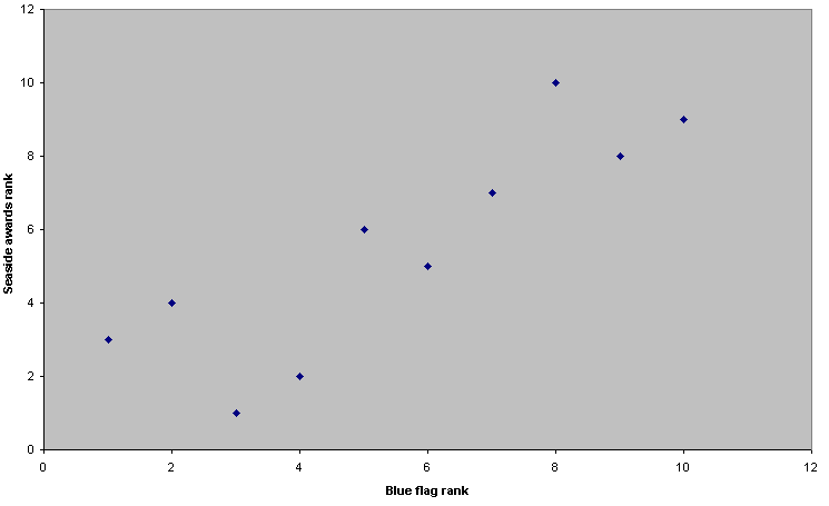
You should be able to see that there does appear to be a clear pattern to the points and that the slope is positive. Also, we now have an good idea of what a positive r value of 0.855 looks like!
As usual, the lowest level of significance that we would be prepared to accept would be at the 95% level. If we look up in the tables, to be 95% confident of some correlation (for n = 10) our value for rs has to be located in a 'band'. The edges of this 'band' have values of either more than 0.649 or less than -0.649 (this indicates that we are using a two-tailed test). That is, it must be outside of this range on either extreme if we are to reject the Null hypothesis (no meaningful correlation). Our result (0.855) is outside of this range so we must reject the Null hypothesis and accept the alternative hypothesis, viz: that there is a meaningful correlation....
 :
:
The critical value (n = 10) at the 1% level from tables is 0.794.
Q. What difference (if any) does this make to our conclusions
Let us now do the same calculation using SPSS
Open SPSS
Go to Variable view and name the two variables: Blueflag and Seaside
Enter the data
Choose: Analyse, Correlate, Bivariate
Transfer both variables to the right hand panel
Tick the Spearman box and also tick ' flag significant correlation'
Click OK
Your output should look like this..
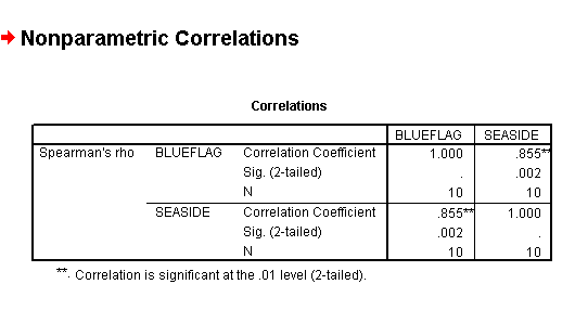
Note also that the output give two correlation's in fact, Blue flag related to Seaside and Seaside related to Blue Flag. Why is this?
Do not get confused between 'scores' and 'ranks'. It is the 'ranks' that are being analysed but they have all been derived from 'scores'.
Here is a more complex example (but exactly the same methodology). The main point repeated here is to take care of the actual rankings themselves. If 2 or more cases give the same score, then the middle position has to be taken for the ranking.
E.G.
|
Score |
Rank |
|
|
|
|
7 |
7 |
|
5 |
5.5 |
|
5 |
5.5 |
|
8 |
8 |
|
4 |
4 |
|
3 |
2.5 |
|
1 |
1 |
|
3 |
2.5 |
The score '3' and the score '5' appeared twice and this has to be accounted for. Both 3's have to be ranked the same ('split the difference') and as there are 8 scores we cannot have more than 8 ranks. Take a little time to study this table to make quite sure that you are comfortable with what has been done.
 The National Trust and English Heritage jointly manage Stonehenge. They are
considering introducing a new pricing policy. The managers are interested to
know what the possible visitor reaction might be. A pilot survey of 30 people
was conducted in order that a more precise survey could be carried out later.
The National Trust and English Heritage jointly manage Stonehenge. They are
considering introducing a new pricing policy. The managers are interested to
know what the possible visitor reaction might be. A pilot survey of 30 people
was conducted in order that a more precise survey could be carried out later.
Two questions were asked...
Q1) How frequently do you visit Stonehenge?
|
VALUE LABEL (visits) |
SCORE |
|
Less than once a year |
1 |
|
about once a year |
2 |
|
about once every six months |
3 |
|
about once a month |
4 |
|
about once every two weeks |
5 |
|
at least once a week |
6 |
Q2) What do you consider to be a reasonable charge to visit this site should be?
|
VALUE LABEL (charges) |
SCORE
|
|
£2.00 |
1 |
|
£3.00 |
2 |
|
£4.00 |
3 |
|
£5.00 |
4 |
|
£6.00 |
5 |
|
MORE THAN £6.00 |
6 |
Q. What will be our H1 and Ho, Null (and the Alternative) hypothesis?
We will continue in SPSS:
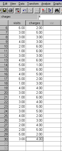
Here is the data set of the pairs of scores recorded for the survey. Remember that SPSS requires all the scores to be entered individually...
open SPSS in the usual manner.
Name variables as visits and charges
Enter the data....
Open Graphs, Scatter, Simple
Transfer 'visits' to the x axis and 'charges' to the y axis
Click OK
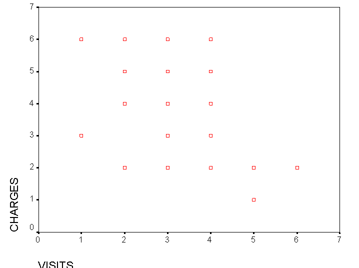
Q. What pattern (if any) can you see here?
Click Analyse, Correlation, Bivariate data
Tick only Spearman's, two tailed and Flag any significance
Click OK
Note that SPSS will automatically rank the data for you when the test is running.
And here is the output..
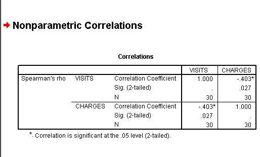
We have obtained an rs value of -0.403, this represents quite a strong negative correlation.
For (n =30) the critical values values for P(0.05) and P(0.01) are 0.362 and 0.467 respectively. Our result falls between these two values. Thus the result is significant at the 95% level (so reject Null) but not at the 99% level.
You will now be able to interpret the P-value directly from the SPSS output above (0.027)
We can conclude by saying that there is a statistically significant [P>0.05] and negative correlation between the number of visits and the charges made.
In general terms, the more frequent the visits the less money the visitor wishes to pay!!.
Here is a further data set to work on yourself...
remember that you should rank both sets before you can analyse them...
 You are a scientist employed
by the RSPCA. It has been suggested to you that the survival potential
of rescued Guillimots (after a recent oil spillage) may be related to their
body weight(kg). Is it possible to determine a correlation between these two
factors?
You are a scientist employed
by the RSPCA. It has been suggested to you that the survival potential
of rescued Guillimots (after a recent oil spillage) may be related to their
body weight(kg). Is it possible to determine a correlation between these two
factors?
The condition of each rescued bird (n =36)(after cleaning) has been scored as:
1 = very poor
2 = fair
3 =good
4 =excellent
Each bird was weighed (in kg)
The condition and weight values for each bird were as follows:
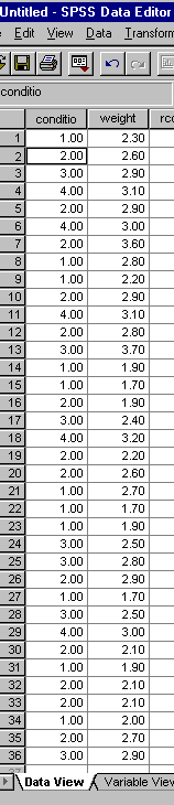
Output a scattergraph first just to gain an idea of the 'appearance' of the data.
SPSS note: If you wish to rank the data yourself; drop down the Transform menu but as stated, be aware that for the Spearman's test, SPSS does this transformation anyway but try both routes and you should get the same results!
You should have found a positive correlation.
Task:
Write a formal proposal setting out the way in which the investigation should be undertaken.
Write out both the Null and Alternative hypothesis
Outline any errors or bias that may affect the outcome.
Produce an SPSS output and include the scattergraph
Interpret the results, are they significant?
Write a concise conclusion.
Go on to linked page ( the PPMCC test)