 abc
abc
abc
Summary of ContentsMore about frequency analysisTesting for NormalityThe Kolmogorov-Smirnov (K-S) tests...(for normality and two-sample) |
You may first wish to re-read the material about Normal Distibutions.
We have seen that a histogram will quickly reveal the main features of a distribution and it will show up the presence of any unusual features such as 'skewness' or a bimodal profile.
So where does 'normality' begin or end?
Is there a 'cut off point' which, when exceeded take the distribution outside of the conventional boundaries of normality.
You may think that this is just an academic question but it is not.
We have commented many times that before embarking upon any statistical procedure, it is essential to establish exactly which tests are appropriate. If your data set does not comply with a normal distribution then non-parametric tests are the only suitable tests to use. In some cases, a transformation of the variable to the log or square of the values will 'create a normal distribution' mathematically and thus allow parametric tests to be used in preference to non-parametric tests.
There are two initial courses of action here to test for normality in your dataset...
1) graphical & 2) using one version of the K-S test...the test for Normality.
If we perform a linear transformation on our data, we will produce a line. The line might be straight, curved or deflected in one area only. The key point to remember is that the straighter that line is, the closer the approximation to a standard normal distribution our data actually is. However, we will endeavour to show that this technique is somewhat unsatisfactory.
We will deal with transformations again in Level I STEP 2
We can revisit another concept here and that is THE STANDARD NORMAL CURVE (DISTRIBUTION)
To refresh your memory. This is the perfectly symmetrical curve where the mean is zero and the standard deviation is one.. You will see this curve notated as: N (0, 1) and if we perform a linear transformation on such a curve then a perfect straight line will be produced.
 In a college laboratory experiment, the incubation times of Diptera sp eggs
were recorded.
In a college laboratory experiment, the incubation times of Diptera sp eggs
were recorded.
66 eggs (n) were monitored on a daily basis and the mean value (x bar) was found to be 3.4 days.
Here is the full data set:
|
1
|
2
|
3
|
3
|
3
|
4
|
5
|
6
|
|
1
|
2
|
3
|
3
|
3
|
4
|
5
|
7
|
|
1
|
2
|
3
|
3
|
3
|
4
|
5
|
7
|
|
2
|
2
|
3
|
3
|
3
|
4
|
5
|
|
|
2
|
2
|
3
|
3
|
3
|
4
|
5
|
|
|
2
|
2
|
3
|
3
|
3
|
4
|
5
|
|
|
2
|
3
|
3
|
3
|
3
|
4
|
6
|
|
|
2
|
3
|
3
|
3
|
3
|
4
|
6
|
|
|
2
|
3
|
3
|
3
|
4
|
5
|
6
|
|
Let us first construct a histogram of this data and mark the median time value:
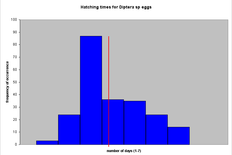
Certainly the graph indicates one peak but it seems set to the right and the mean (red line) does not pass through the highest frequency set.
Next we must produce a Cumulative frequency table as we have done before.
Also check out Ogives if you need to remind yourself.
However, this time we need z-values, this is in order to produce a new kind of plot called a Normality Plot. Look up the Cumulative frequency %'s in the z-tables and read off the value and add it to the table...
|
Value
(in days) |
Frequency
of occurrence
|
%
freq
|
Cumulative
% freq
|
z-value
(from tables)
|
|
|
|
|
|
|
|
1
|
3
|
4.5
|
4.5
|
-1.70
|
|
2
|
12
|
18.2
|
22.7
|
-0.75
|
|
3
|
29
|
44.0
|
66.6
|
0.43
|
|
4
|
9
|
13.6
|
80.3
|
0.85
|
|
5
|
7
|
10.6
|
90.9
|
1.33
|
|
6
|
4
|
6.1
|
97.0
|
1.88
|
|
7
|
2
|
3.0
|
100
|
3.40
|
|
|
|
|
|
|
Now plot cumulative f against z; a perfect straight line would indicate that the data is normally distributed....
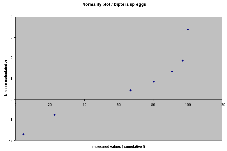
This shows an approximation to a normal distribution except that the upward kink at the top indicates that our data is in fact skewed to the left. However, the overall distribution of the points does seem to lay approximately along a straight line, the implication would be that the samples do come from a normally distributed population. The decision is certainly not clear cut because one might equally say that the line follows a gentle curve! So which hypothesis is correct!!?
This is a similar plot to the one described above and again, is intended to produce a straight line if the input data is normally distributed.
Go to Graphs, Q-Q, tick 'standardise data' and ensure that the distribution for comparison is the default setting 'normal'. Click OK.
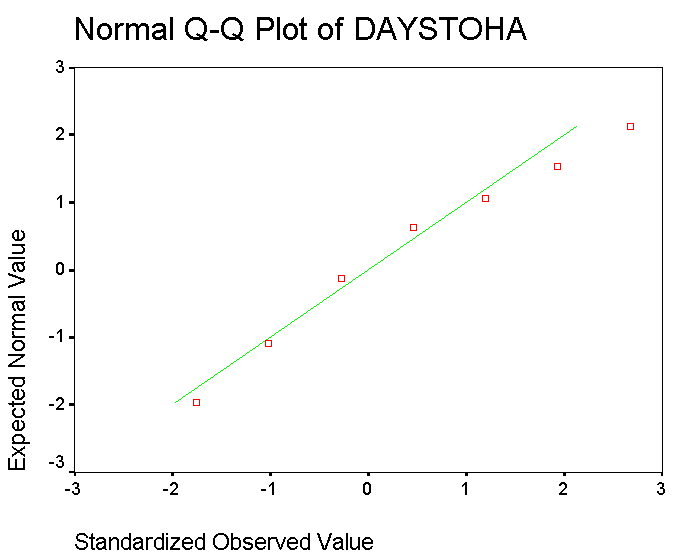
Once again, we have a plot that approximates to a straight line but is nevertheless not straight!.
We have shown that the graphic method is somewhat arbitrary and that some sort of 'benchmark of confidence' needs to be laid down. Fortunately there is a test that can be applied to O. I. and R data that will help us to make the final decision. You might say that this is another 'goodness of fit' test.
We will soon be able to place a 95% confidence level on our decision if we use the test for normality version of the K-S test.
All versions of the K-S test have one thing in common, they compare two cumulative frequency distributions. They show up any differences between the distributions of sets of 2 samples. A significant difference might mean that the population medians are different (if Ordinal data is used), the variances are different or that the shapes of the distributions are different.
Now: what if, instead of working with two sets of experimental data for comparisons, we specified that one of the data sets had to be a standard normal distribution to begin with. Now we have given ourselves a 'benchmark' to which we can try to relate our test set. How closely will the test dataset overlap the benchmark standard normality curve?.
If there is little or no discrepancy, we make take it that our test set is normally distributed. Conversely, if the P-value that we calculate yields P<0.05 then our sample probably does not come from a population the that is normally distributed. Hence we are simply comparing our test distribution with a theoretical one.
The K-S test of normality (called 'goodness-of-fit' in SPSS) uses a similar philosophy to the one we encountered for Chi-squared...that of OBSERVED Vs EXPECTED frequencies..
Looking back to the scattergraph above, we will be asking "how closely does the line through our data relate to a line produced by a standard normal distribution".
The Null hypothesis will therefore be:
"There is no difference between the distribution of the test sample and a standard normal distribution".
The alternative hypothesis will state that there is a difference and therefore our sample is not normally distributed.
Open SPSS
Choose: enter data
In variable view name the variable (think what the variable here is)
Switch to data view and enter the data from the above table (66 Diptera eggs etc)
Choose Analyse, Nonparametric tests, 1-sample K-S
Transfer the variable to the Test variable list
Check that the default Normal checkbox is ticked
Click OK
Your output should look like this:
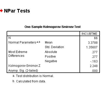
A Z value of 2.248 has a corresponding Standard normal probability value of 0.9877. This result is highly significant and so we must accept the alternative hypothesis. We must now conclude that this data is not normally distributed.
Q. Can you write out an accurate concluding statement based on this result (refer back to the histogram).
Here we will be seeking to establish whether or not there is a meaningful difference between two independent distributions. So we are looking to discover what level of similarity there is between the two sets of sample values. The data must be at least on the Ordinal scale. If the shapes of the two distributions neatly overlap each other, it would be reasonable to suggest that they came from the same population.
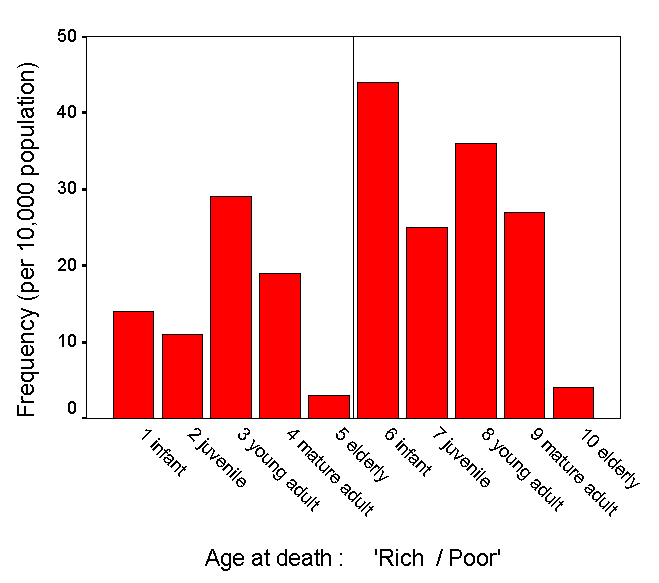
Study the chart below. Here is an example where we want to know if the distribution (of deaths) is the same for 'rich' countries as it is for 'poor' countries. We have plotted the frequency of death and chosen 5 age groups to investigate. Can you see that the two distributions appear to be quite different but "just how different" is the question to be asked here. If we were to show that there was no difference then we would have to accept that as confirmation of the Null hypothesis.
Put another way: "Have the samples been drawn from the same population"? & "Is there any real distinction (w.r.t. age at death) between 'rich' and 'poor' countries?
Here is a worked example....
 The
beach stranding of Dolphins is becoming an increasingly common occurrence along
our shores. Imagine that the RSPCA has collated details of 220 (n) dolphins
that were found dead or dying on West Country beaches in 2001. The individual
reports distinguishe between male and female and between infants, juveniles,
young, middle or old adults. We wish to now establish whether there is any difference
between males and females with regards to beach stranding.
The
beach stranding of Dolphins is becoming an increasingly common occurrence along
our shores. Imagine that the RSPCA has collated details of 220 (n) dolphins
that were found dead or dying on West Country beaches in 2001. The individual
reports distinguishe between male and female and between infants, juveniles,
young, middle or old adults. We wish to now establish whether there is any difference
between males and females with regards to beach stranding.
We can tell very little from the total numbers because it is a sample from a population of unknown size and the strandings may not be random in the ecolgical sense. For example, it may be that males are more likely to swim near to the shore or females may escort their young to sheltered waters etc.
Our Null Hypothesis will be:
" There is no difference in the stranding pattern exhibited by male dolphins and that exhibited by female dolphins"
We will be seeking to establish the maximum absolute difference (D) between the two cumulative %'s and then compare that to critical values in the K-S tables or from formula calculation. If the sample sizes of both sets is less than 50, it is possible to go straight to the K-S tables to look up the critical value for both the 5% confidence level and the more stringent 1% level. If the sample sizes exceed 50 (in either set), we have to use 2 formulae to obtain the tabulation (to compare with our D-value) statistic.
Here is the data set:
|
Class
|
Males
|
Females
|
%
Male
|
%
Female
|
Cum
% Male
|
Cum
% Female
|
D
=differential
|
|
Infant
|
15
|
46
|
0.185
|
0.331
|
0.185
|
0.331
|
0.146
|
|
Juvenile
|
12
|
26
|
0.148
|
0.187
|
0.333
|
0.518
|
0.185
|
|
Young
Adult
|
30
|
37
|
0.370
|
0.267
|
0.703
|
0.785
|
0.082
|
|
Middle
adult
|
20
|
28
|
0.248
|
0.201
|
0.951
|
0.986
|
0.035
|
|
Old
adult
|
4
|
2
|
0.049
|
0.014
|
1.000
|
1.000
|
|
|
TOTALS
|
81
|
139
|
1.000
|
1.000
|
The largest differential (the maximum absolute difference) is shown by the Juveniles so our D-value is 0.185
We must now use the following formulae because our sample sizes both exceed 50 .....
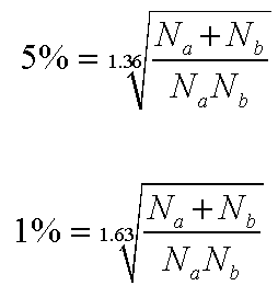 |
K-S tabulated critical value (5%) = 0.190
K-S tabulated critical value (1%) = 0.228
Our calculated test result (D)(0.05) was 0.185 and is less than tabulation and this means that it has not reached a 'critical mass' sufficient to reject the Null Hypothesis and so we therefore must accept it. You can also see that we are understandably even further away from accepting any alternative hypothesis at the 1% level!
If you wish to use SPSS for this type of analysis:
When entering the data in 'data view' you will need 2 value labels for 'sex' and 5 for 'age group'.
Then go to 'Analyse', 'Non-parametric', '2 Independent samples' and tick 'Kolmorogov-Smirnoff Z'......>>>>>
You will obtain a 'Z' value of .949 and a significance value of .329. This result is not significant and therefore we still accept the Null hypothesis.