 abc
abc
abc
Using and interpreting 'official figures'Handling misleading or corrupted data |
You may wish to browse through some of the websites selected as useful examples of data that is in the public domain.
Go to Sources of electronic information
It is perhaps a weakness of dealing with statistics that have been generated elsewhere, that we do not necessarily know how reliable they are , how they were collected or if they have been 'manipulated' in some way. Television advertising will often make bold claims such as "this spread will reduce your cholesterol levels by half" ....half of what....do they mean by 50% or do they mean half of eight is 4 and if so, what if your cholesterol level is already 4...will it now be reduced to zero!. What is the basis for such claims?
How often today do we hear that some pressure group wishes to take issue with 'official government statistics'. Certainly within the National Health system and the education system, this is a daily occurrence.
Often statistics will confuse because units are omitted or not properly applied. We are very gullible where numerical data is concerned and 'official figures' will frequently overawe us.
"It must be true, I saw it in an official table".
Suppose a newspaper asked 100 members of their staff whether they had been abroad in the last 6 months.
82 said they had.
This might be printed in a number of ways:
1) Simply as it is stated (unlikely)
2) "82% of people questioned have been abroad in the last six months" (no reference to who they were)
3) "82% of the population have been abroad in the last 6 months" (gross extrapolation) *(That would mean some 50 million people).
Or: "72% of motorists disapprove of the use of mobile phones when driving"
1) How large was the sample size?
2) Why only ask motorists?
3) How was the question phrased...what choices of answer were the respondents given?
4) Were the respondents referring to other people using mobile phones or were they including themselves in their disapproval?
So we can see that gathering spurious data is very easy and can then be presented in such a way as to suggest that it has been collected in a valid and meaningful way.
The problem with gathering accurate data is that it is a expensive, painstaking process and often very time consuming.
Sampling error is not the same as sampling bias; the former refers to the fact that we always have to use samples (taken from a population) rather than using the whole population. The latter refers to the accidental (or deliberate) weaknesses of the chosen sampling method.
Even when data has been collected in a carefully controlled manner it may be that certain values appear to be too large or too small (such values are called 'outliers'). Do we include them or do we leave them out?
Look at the following chart:
16 men were asked what their age was when they got married:
|
24
|
23
|
27
|
24
|
|
26
|
19
|
22
|
26
|
|
23
|
25
|
23
|
24
|
|
19
|
24
|
27
|
39
|
The mean value is: 24.7 but if we leave out the last value (39) the mean age becomes 23.7.. a full year less!
We stated earlier that the mean is very sensitive to such 'outlier' values.
Even if we used a much larger sample size there is always the possibility that outliers will occur.
Any good scientific report or dissertation must be based upon representative samples and this means that every source of bias has been minimised. In theory, the only type of sample that can be tested statistically with impunity is the true random sample. This is one picked completely by chance from the total population to which that sample belongs.
A further source of confusion can arise in official documents when the Mode or Median values are quoted and termed 'the average'. It may be that whichever of the three options demonstrates the writer's argument in the best light will be the one that will be used.
In 1935 the incidence of Polio (among children) in America was 0.17%
In a vaccine trial at the time 490 children were vaccinated and 660 others were monitored as controls. None of the vaccinated children developed the disease but neither were there any cases amongst the control set either.
The company concluded that the vaccine was effective! But at that rate of current incidence (1.7 per thousand) only 1 - 2 cases would have been expected anyway. Obviously a much larger sample would be needed before any valid conclusions should have been drawn. If such an experiment had been furnished with the level of significance it would have immediately shown up the inadequacy of the trial.
Remember also that the range of the dataset may give valuable information and help the reader because the spread will indicate whether the results are bunched around the mean or conversely much dispersed away from the mean.
Thus it is important to ensure that as much of the raw data as possible is presented to the reader in an easily digested fashion.
Consider the following newspaper statement...
"There are 4 times more fatalities on the M1 between 6pm and 7pm than there are between 6am and 7am".
This may well be true but the statement is very misleading because it does not take into account that there is far more traffic using the road in the evening rush hour than in the very early morning. There is nothing here to prove that you, as an individual driver are at any more risk in the evening than in the morning.
When attempting to make inferences from your data be very sure that your conclusions are supported by the data and the analysis that you have done.
In the above case it would have been more meaningful to compare traffic density (cars / hour) with fatalities / '000 traffic movements. By taking observations at different times of the day it would be possible to comment authoritatively on fatalities related to time of day if that was the intention of the exercise.
Care must be taken in using percentages especially if you are trying to indicate the magnitude of an increase or decrease in a variable.
"The number of Little Tern eggs that have hatched successfully this year is down by 6.5%" This sounds quite serious but let us look at the real figures.
|
Little Terns |
2000 |
2001 |
|
Number of eggs laid |
110 |
140 |
|
Successful hatchings |
70 |
80 |
|
% of eggs laid to successful hatchings |
63.6 |
57.1 |
In fact, there were 10 more successful hatchings so although the % calculation is not wrong, it is misleading.
If in doubt, it is better to simply report the descriptive statistics and dispense with %'s unless you are quite sure that they will be unambiguous.
An association between two factors is not proof that one has caused the other.
We cannot simply say "if B follows from A, then A has caused B".
For example, there will be a close correlation between the incidence of disease and the lack of a clean water supply. It is tempting to say therefore that dirty water causes disease. This is incorrect, whilst there is a connection, it is the microorganisms in the water that cause the diseases not the water itself.
Here is another example....the suicide rate in Britain reaches a peak each year around Christmas. So we can say that there is a correlation here but it is stretching the truth to simply say that "Christmas causes suicides".
Correlation and regression tests should always include confidence limits before any conclusions are drawn about the nature of the relationship between the variables under scrutiny.
 |
RAT POPULATION IN ENGLAND SINCE 1970
What real information do the images above really convey?
There are no axes drawn in so is this meant to be a graph? Is this some sort of histogram perhaps plotting time on the X axis against rat numbers on the Y axis? Or is the suggestion that rats have simply grown bigger? Or have they got bigger and increased in numbers? It is all very ambiguous. Certainly a trend is intimated but that is about all. We are given little idea about how the conclusions were arrived at or what the absolute values are or even what the true time scale is.
Such devices have limited uses. They are frequently used in populist magazines and journals. They do add dramatic effect to an idea. However, they are generally imprecise as a technique for conveying truthful information and are easily misinterpreted by the reader.
For this reason, they are best avoided in academic writing.
By manipulating the scales on either axis of a graph a very different image can be created. Where differentials are to be displayed it is important that the absolute values of each class are displayed in full...
 Consider the following imaginary case.
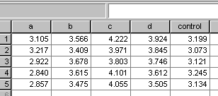
A fertiliser manufactures has recently developed a new foliar feed treatment for potatoes called 'maxispud'.
Five large-scale commercial field trials were undertaken that involved 4 levels of treatment (5, 10, 15, & 20 l/ha in 1000l of water /ha) and a control.
Here are the results (tonnes / hectare):
and here is the 'honest' bar chart that reflects those results...
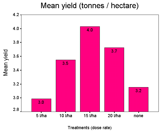
Note that the lowest dose rate actually gave a lower yield when compared with the control plots. This may be a fact that the manufacturer may not wish farmers to know.
So, if we delete all but the 'best' column and 'resize' the graph, we can generate quite a different perspective on these results....
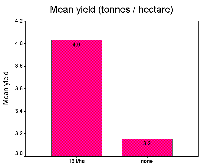
" Maxispud can help you to increase yields by more than 37%"
If we look back at the original data set it will be seen that in order to use the figure of 37%, the lowest yield from the controls has been compared to the highest yield obtained from the 15 l/ha treatment...
4.222 / 3.073 =1.3739. I.e. 37.39%
The mean yield improvement at this dose rate would only be 4.0 / 3.2 = 25%.
*** No reference has been made to the cost of treatment. If the material is expensive then the extra yield may not be sufficient to cover the cost of materials and application.
*** No reference has been made to other factors that might have affected yields such as soil types and weather conditions during the growing period.
*** No secondary control was implemented whereby plain water was sprayed on the crop at 1000 l/ha. It may be that it was the water that contributed to the increase in yield.
*** No reference has been made to crop residues or potential taint on the crop.
*** No reference has been made to the fact that the yield actually dropped when more than 15 l/ha were applied to the crop.
In other words, whilst the product may well be a useful and practical one, the way that the the trials were designed and the statistics thus generated can both be manipulated to show something in a favourable light.
These dubious methods are an ever-present danger.
In some cases these problems arise through ignorance or by accident rather than design but it is important that in your work, you endeavour to ensure that your results are presented in an honest and forthright way and that any conclusions you make can be substantiated by your test methods and results.
Never be tempted to fabricate data or to present what you would have liked to happen, you will be found out!
Furthermore, it is very wasteful to collect and collate your data properly and then fail to extract the hidden (but valid) information that it contains.